Over the past year, I have spent countless hours studying thumbnail psychology. Scroll stoppers, attention grabbers, and view holders. Below is an analysis of my thumbnail work, and how I work to maximise clicks and viewer retention.
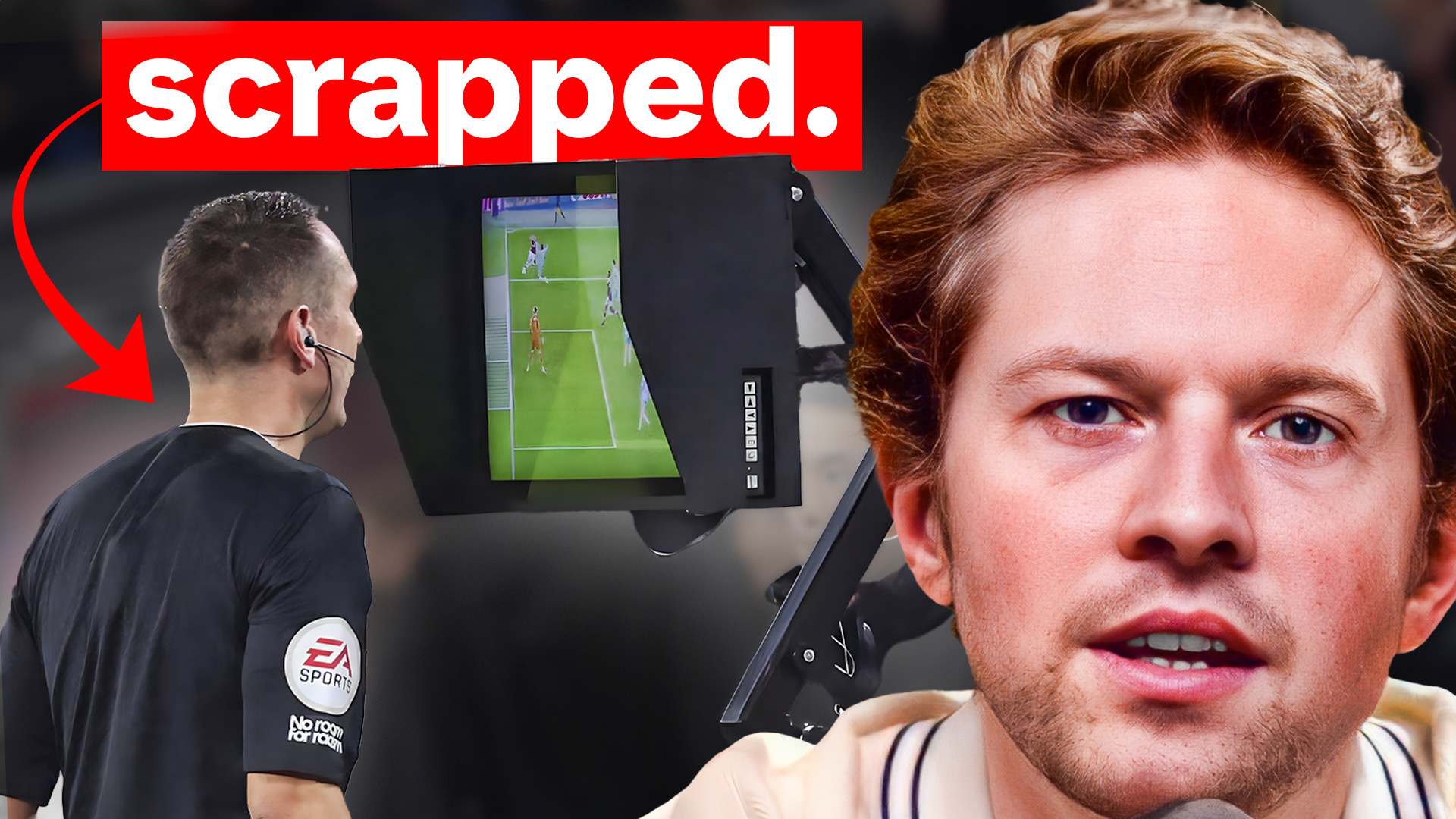
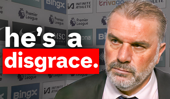
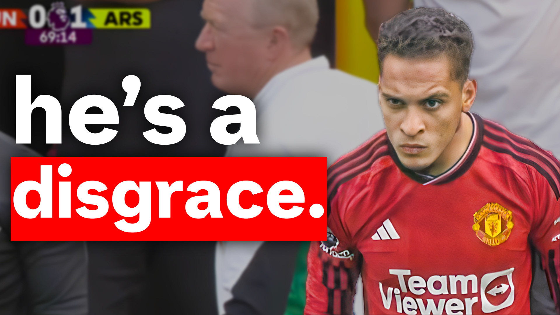
Short and snappy hooks combined with red boxes, a staple in the thumbnail game. These captions work to grab viewers attentions and curiosity - why is he a disgrace? Why was VAR scrapped? The viewers click in search of answer - and stay until they get that.
All 3 videos above were 1/10 performers.
The latter 2, caused an increase of 10% in a client's CTR.


This video package is always a top performer. Introduced to me by a good friend Rimedi, a good story telling video combined with 3 recognisable faces on the thumbnail.
The aim of these thumbnails is to jack the audience, and that is exactly what they did.
All 3 videos, yet again, 1/10 performers.
Rimedi averages 1.5k views or so per video.
But after some discussion and analysis, we created a video package we believed could take his content to the moon.
And despite the design being much more simple than the rest of those on his channel, the video garned 100,000+ views. Absolutely blowing the rest of his videos out of the water.

This thumbnail for King Kenny focuses on two things mainly.
1. A recognisable face.
2. An unfamiliar object or experience which the user wants to know about, here being the Beta Squad store,
2 simple staples, 1 top performer. This video yet again, was a 1/10.
Overall, thumbnail design is a much more complex game than what it seems on the surface. The psychology is just as, if not more important than the design. And I pride myself on producing video packages which can take your content to the moon.